Case Study
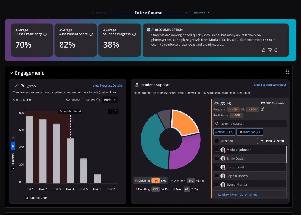
Intelligent Instructor Dashboard
Using AI to turn complex instructor data into actionable insights.
<60 seconds
Every participant was able to determine overall course health in under 60 seconds.
Actionable
Transformed instructor analytics from a reporting experience into a decision-support experience.
Trustworthy
Introduced AI in ways instructors considered useful and trustworthy while keeping instructors in control.
01. Overview
Making instructor analytics actionable.
The Problem
Carnegie Mellon University Open Learning Initiative’s online learning platform, Torus, provides instructors with extensive data about student progress, learning proficiency, assessments, and course engagement. However, previous research revealed that instructors rarely used the existing analytics interface while a course was actively running.
Instead, most instructors only interacted with analytics during course setup or after the semester ended. During instruction, the interface required too much navigation, filtering, and interpretation to answer basic questions:
- How are students progressing and performing?
- Which students need attention?
- What should I do next?
Instructors had data, but they lacked a clear overview and actionable direction.
The Opportunity
Through prior research and usability studies, I identified an opportunity to rethink instructor analytics around a simple premise:
I created a product opportunity proposal and presented it to leadership, advocating for the creation of an Intelligent Instructor Dashboard. The proposal was supported by a user journey map I developed to identify gaps in the instructor workflow and uncover opportunities for decision support.
The Outcome
I designed an AI-assisted Instructor Dashboard that:
- Surfaces the most important course insights at a glance
- Highlights actionable recommendations
- Reduces the time required to assess course health
- Balances simplicity for casual users with depth for expert users
- Introduces AI in ways instructors considered useful and trustworthy
In testing, every participant was able to determine overall course health in under 60 seconds.
02. Research
Understanding what instructors need, when they need it, and where AI can help.
Understanding Instructor Needs

While prior research validated the need for an instructor overview, several important questions remained unanswered:
- What information matters most to instructors?
- How does that information change throughout a semester?
- What role should AI play?
- What AI experiences would instructors actually trust?
- How are competing platforms approaching instructor dashboards?
To answer these questions, I conducted multiple research activities.
Research Methods
Literature Review
I facilitated a UX intern project to review instructor analytics, educational decision-making, and learning dashboards.
Competitive Analysis
I analyzed analytics experiences across educational platforms to understand common patterns, strengths, and gaps.
Instructor Interviews
I interviewed instructors about daily workflows, existing analytics usage, pain points, mental models, and attitudes toward AI.
03. Key Insights
Instructors didn't need more data. They needed better direction.
Insight 1: Instructors Need Context-Specific Information
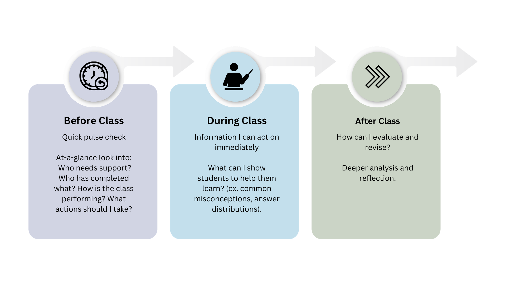
What instructors care about changes throughout a course. Before class, instructors want a quick pulse check. During class, they want information they can act on immediately. After class or after the semester, they want deeper analysis and reflection.
This reinforced the need for an overview experience designed around active teaching rather than retrospective reporting.
Insight 2: Instructors Want Guidance, Not More Data
Most instructors did not need additional metrics.
They wanted help understanding:
- What deserves attention
- Why it matters
- What they should do next
This transformed the problem from an analytics challenge into a decision-support challenge.
Insight 3: Instructors Trust AI When It Proves Its Value
Participants consistently expressed willingness to use AI when it provided practical value.
If it saves me time.
— Instructor participant
If it's something I can easily review.
— Instructor participant
However, instructors were uncomfortable with higher-risk AI applications involving direct student learning content or autonomous decision-making.
This finding significantly influenced the AI strategy.
04. Design
Designing AI as an assistant, not an authority.
Designing with AI
One of the most interesting challenges in this project involved defining how AI should appear in the instructor experience.
When I joined the team, Torus already contained an AI chatbot in the student interface. However, that work predated the existence of a dedicated UX practice and had not been grounded in a broader AI design philosophy.
Rather than immediately designing features, I first worked to establish principles for responsible AI experiences.
Creating an AI Design Framework
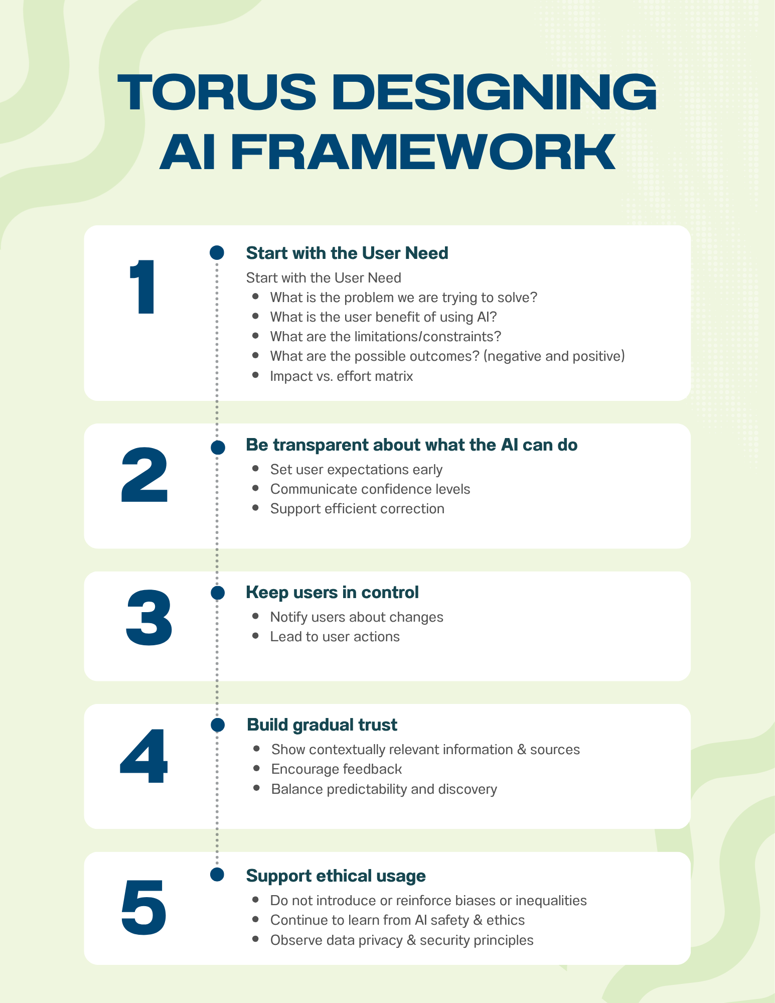
I researched emerging AI design patterns, reviewed industry guidance, and developed an internal framework for designing AI-powered experiences.
I then presented this framework to the team to help guide future AI initiatives.
Defining the AI Opportunities
Using research findings and the framework, I identified two opportunities that aligned well with instructor needs.
AI Recommendations
The strongest opportunity was helping instructors identify actionable insights hidden within existing dashboard data.
Rather than generating new information, the AI would analyze existing course metrics and surface recommendations such as:
- Students requiring attention
- Learning objectives showing struggle
- Engagement concerns
- Potential intervention opportunities
This fit naturally into the dashboard's goal of reducing time-to-understanding.
Importantly, recommendations were explainable and tied directly to visible data.
AI Draft Emails
A second opportunity focused on reducing administrative effort.
The dashboard could generate draft outreach emails based on identified situations, allowing instructors to review, edit, and send communications more quickly.
This was considered a low-risk application because:
- The instructor remained in control
- Outputs were easily reviewed
- The workflow addressed a common pain point
Together, these features created meaningful value without introducing significant trust concerns.
Rapid Exploration
I explored dashboard layouts, information hierarchies, and interaction patterns using Figma, ChatGPT Edu, and Figma Make.
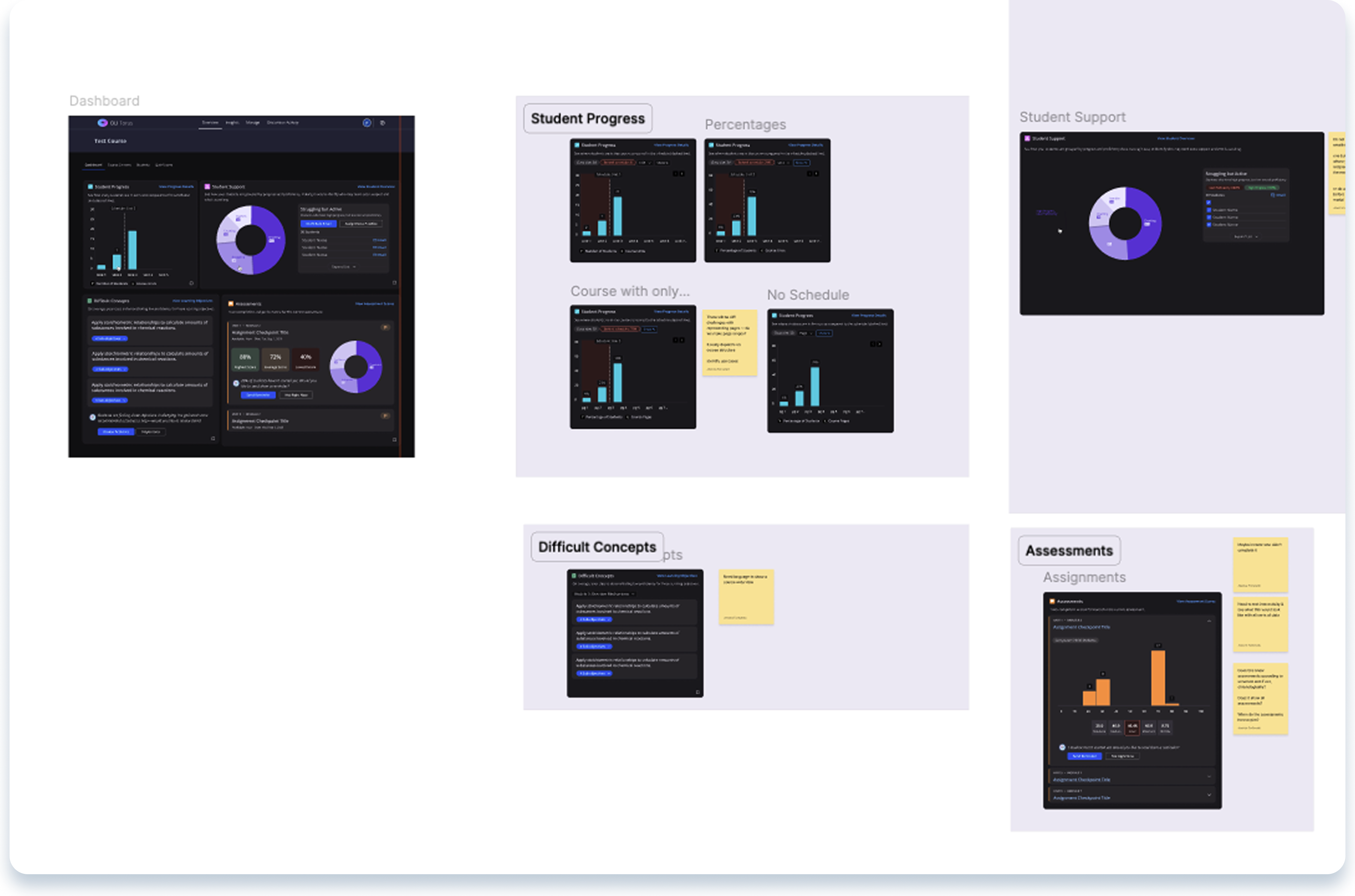
Throughout the process, I met regularly with:
- The Development Lead
- Learning Engineers
- Product stakeholders
- Support team members
These conversations helped ensure solutions remained technically feasible and aligned with educational goals.
The Biggest Design Challenge
The hardest problem was balancing two very different instructor needs.
Quick Overview
Some instructors wanted a pulse check they could read in seconds—not another dense analytics report.
Deep Analysis
Others needed to explore large amounts of data and perform detailed analysis.
Progressive Disclosure
The dashboard presents a simple overview first, with pathways into deeper analytics for instructors who want more. Both audiences get what they need, neither is overwhelmed.
05. Iteration & Validation
Instructor Workshops
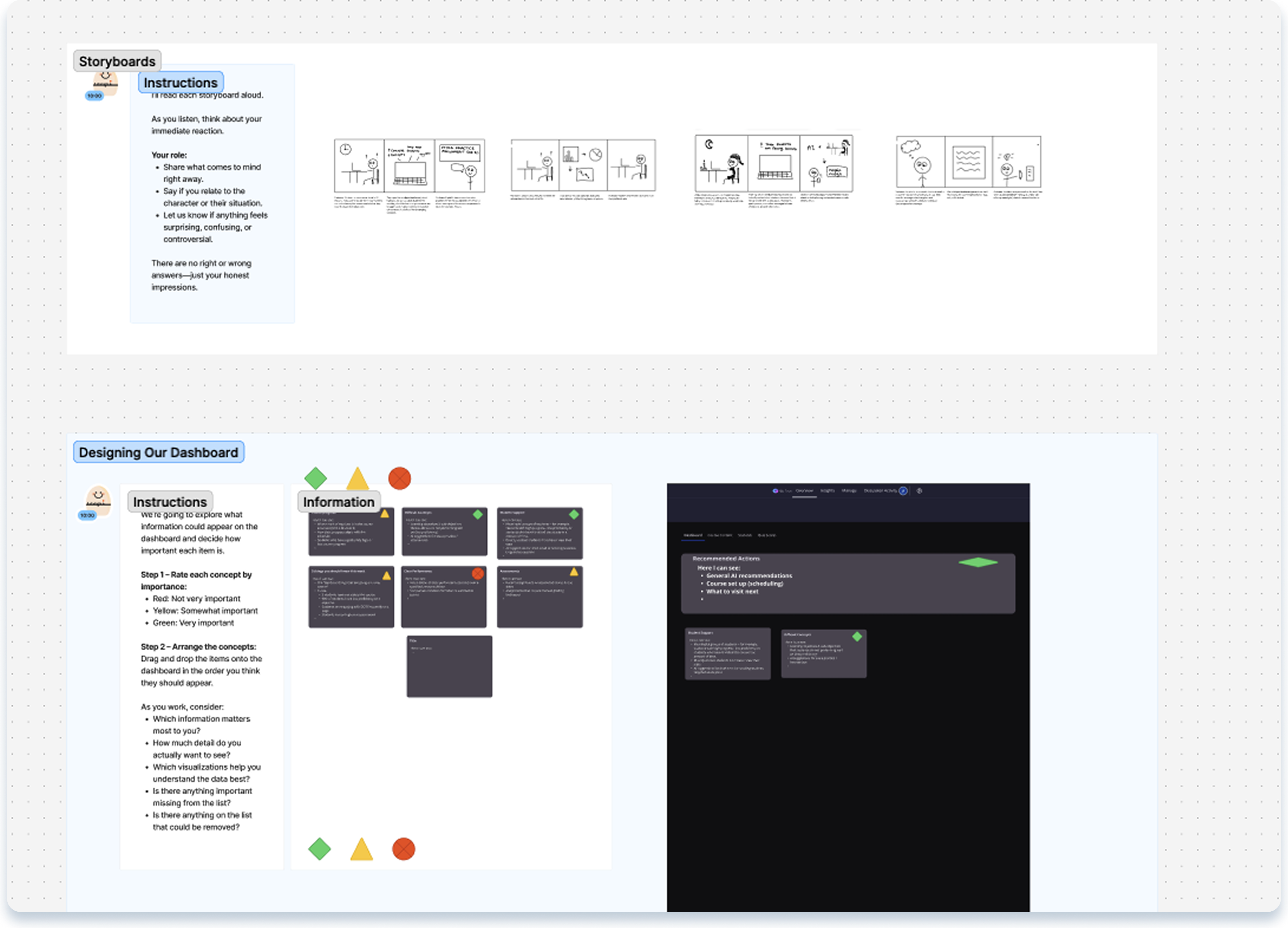
I facilitated workshops with instructors to validate priorities, review concepts, and discuss dashboard workflows.
User Testing
The dashboard evolved through multiple rounds of testing and feedback.
Multiple rounds of usability testing focused on:
- Comprehension
- Information hierarchy
- Recommendation usefulness
- Trust in AI-generated content
Each round informed revisions to both content and interaction design.
AI Recommendation Proof of Concept
One lesson from previous AI efforts was clear:
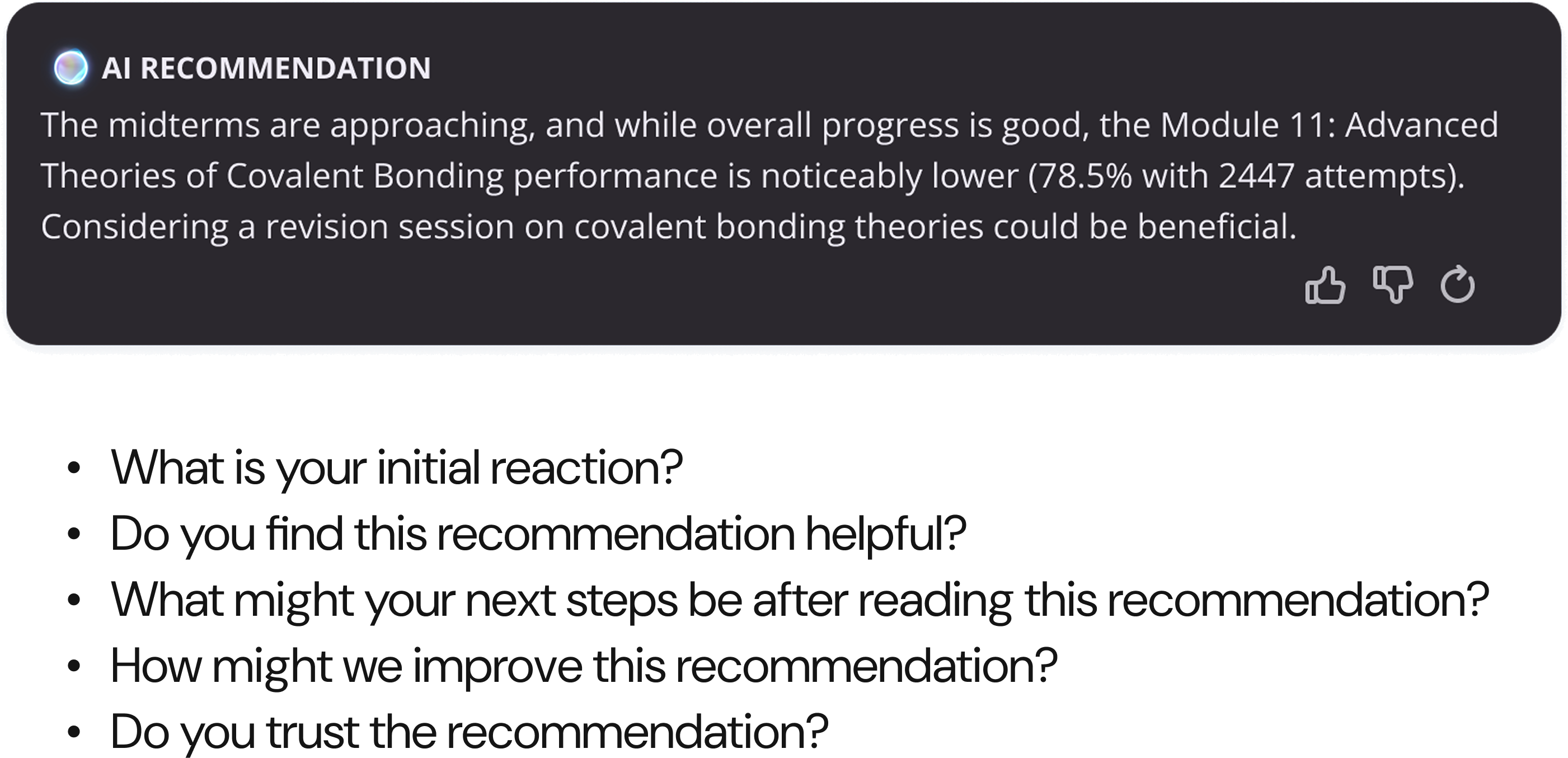
Instead of assuming recommendations would be useful, we built a proof of concept and tested real recommendation scenarios.
I evaluated numerous use cases, refined prompt structures, and reviewed outputs with internal stakeholders and learning engineering experts.
This process allowed us to identify weaknesses early and increase confidence that recommendations would provide meaningful value before development began.
06. Results & Next Steps
Turning instructor analytics into decision support.
Outcomes
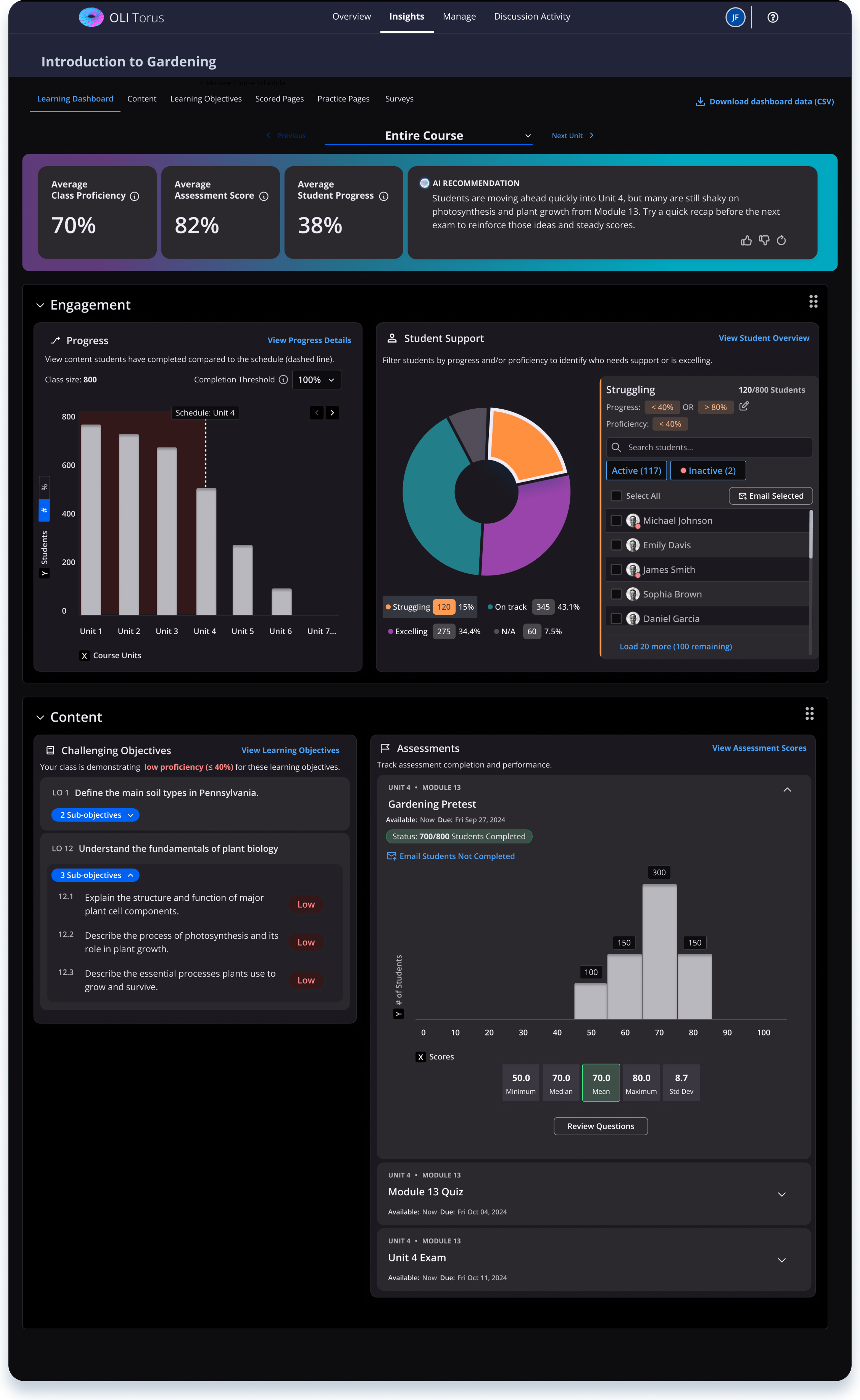
The final design successfully achieved its primary goal:
Participants were able to determine overall course health in under 60 seconds.
The dashboard transformed instructor analytics from a reporting experience into a decision-support experience.
<60 seconds
Time to determine overall course health
Actionable
From reporting to decision support
Trustworthy
AI that stays explainable and in the instructor’s control
Looking Ahead
Following release, success has been measured through:
- Feature adoption
- Dashboard engagement
- Instructor feedback